
Most modern website builders promise speed. In reality, speed breaks the moment content starts scaling.
According to industry research, over 65% of website redesign delays happen after visual approval, usually when CMS structure, responsiveness, or real content enters the picture. Static-first tools handle visuals well. Traditional stacks handle structure well. Very few handle both without friction.
This is where Webflow fundamentally differs. Unlike visual-first builders like Framer or plugin-heavy systems like WordPress, Webflow operates as a visual development environment. You’re not designing representations of a website. You’re designing the actual layout logic, CMS structure, and responsiveness using real HTML and CSS concepts, without writing code.
That difference matters. Especially for content-driven websites where pages, collections, and edits don’t stop after launch.
In this blog, we break down Idea Fueled’s Webflow design process step by step. Not as a comparison post. Not as tool advocacy. But as a clear look at how we use Webflow to build visually powerful, CMS-ready websites that scale cleanly and remain easy for clients to manage long after launch.
What You Will Learn?
- The complete Webflow design process we follow: From planning the site structure to final handoff, explained step by step without theory or fluff.
- Why Webflow works better for scalable, CMS-heavy websites: Especially for sites where content, pages, and sections keep growing after launch.
- How we maintain design accuracy without writing code: By designing with real layout logic, global styles, and reusable components inside Webflow.
- What you actually get at the end of the project: A live, editable, production-ready website that you can manage confidently without developer dependency.
Why Do We Build Websites Directly in Webflow?
We don’t treat Webflow as a design tool. We treat it as a visual development environment.
When teams design in static tools and then hand over designs to developers, the final website is always an interpretation. Spacing changes, layouts shift, responsiveness is adjusted later, and the CMS is forced in after visuals are approved. That gap is where most quality loss happens.
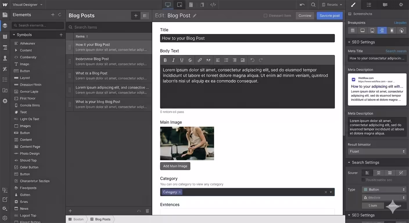
In Webflow, we design using real HTML and CSS layout logic from the start. That means sections, grids, flex containers, breakpoints, and CMS structures are part of the design process, not something added later. What we design is what goes live.
This approach removes the Figma-to-development distortion entirely. There’s no translation layer, no guesswork, and no rebuilding approved designs from scratch. Design and structure evolve together in the same environment.
Structure matters more than animation in Webflow. Clean layout systems, consistent spacing, and scalable CMS foundations do more for long-term usability than visual effects. By prioritizing structure first, we ensure the website stays maintainable, performant, and easy to edit as content grows.
That’s why our Webflow design process focuses on building the website as a real product from day one, not a visual concept that needs to be rebuilt later.
Traditional Web Design vs Our Webflow Design Process
Most website problems don’t come from bad design. They come from broken handoffs and late structural decisions. This is where the difference between traditional workflows and our Webflow design process becomes obvious.
| Traditional Web Design Process | Idea Fueled Webflow Design Process |
| Designed in static tools like Figma | Designed directly in a live, production-ready environment |
| Requires developer handoff | No handoff, visual development happens in Webflow |
| Responsiveness added near the end | Responsive layouts planned from the first section |
| CMS structure added after design approval | CMS architecture planned before UI finalization |
| Frequent design-to-build mismatch | What’s designed is exactly what goes live |
| Edits require developer support | Client-friendly editor and CMS for easy updates |
Verdict: For content-driven and scalable websites, Webflow wins because structure and design are handled together. Instead of designing first and fixing later, the site is built correctly from the start, making it easier to scale, edit, and maintain long after launch.
The Complete Step-by-Step Webflow Design Process
Our Webflow design process is structured to eliminate rework, reduce dependency on developers, and produce websites that scale cleanly as content grows. Each step builds on the previous one, so nothing is rushed or patched later.
Here’s the full workflow at a glance:
- Discovery & Architecture Planning
- Wireframing with Layout Logic
- Style System & Design Tokens
- High-Fidelity UI & CMS Build
- Testing, SEO & Performance Optimization
- Handoff, Training & Ownership
Step 1: Discovery & Architecture Planning
Every successful Webflow project starts before design. If the structure is wrong, no amount of visual polish can save the website later. In this stage, we focus on clarity and architecture, not aesthetics. The goal is to understand how the website should work before deciding how it should look.
We begin by defining:
- Business goals and primary conversion actions
- Target audience and content expectations
- Required pages and their hierarchy
- CMS needs such as blogs, case studies, services, or dynamic pages
- Content ownership. What exists, what’s missing, and what needs refinement
- Scalability requirements for future pages and collections
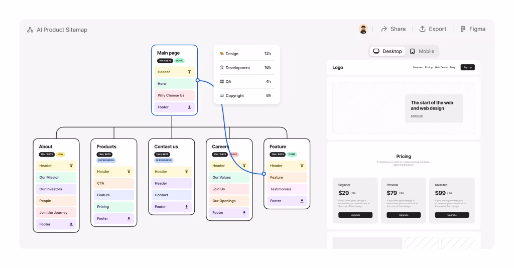
Once this is clear, we plan the information architecture. This includes sitemap creation, page relationships, and CMS structure planning. In Webflow, CMS decisions affect layout, templates, and future flexibility, so we treat this as a foundational step, not an afterthought.
We also map user flow early. This helps us decide:
- Which pages need stronger visual emphasis
- Where navigation should simplify or expand
- How content should guide users toward key actions
By the end of this step, we have:
- A clear sitemap
- Defined CMS collections and fields
- A shared understanding of structure and priorities
Only after this alignment do we move into layout and wireframing. This ensures the Webflow build is intentional, scalable, and free from structural rework later.
Step 2: Wireframing with Layout Logic

With the structure locked, we move into wireframing. But in Webflow, wireframing is not about drawing boxes. It’s about defining real layout behavior.
Instead of creating static wireframes in a separate tool, we build the page structure directly in Webflow using sections, containers, grids, and flex layouts. This allows us to think in terms of how the website will actually respond across devices, not how it looks in a single screen size.
At this stage, we focus on:
- Section hierarchy and page flow
- Grid and flex layouts for predictable responsiveness
- Spacing systems and alignment consistency
- Breakpoint behavior for desktop, tablet, and mobile
- Content priority and reading order
All visuals stay intentionally minimal. No colors, no imagery, and no decorative elements. This keeps the focus on usability, clarity, and structure.
Because this wireframe lives inside Webflow, we can test real responsiveness immediately. Layout issues are solved early, not patched later. We also validate that CMS-driven sections will scale correctly when content length changes.
By the end of this step, we have a working structural framework of the website. It already behaves like the final product, just without visual styling. This makes the transition into design fast, controlled, and free from layout surprises.
Step 3: Style System & Design Tokens

Before we make the website look polished, we make it consistent. In Webflow, this step is critical because every styling decision becomes part of a reusable system. If styles are applied page by page without structure, the site becomes hard to scale and even harder to maintain.
At this stage, we set up the global style foundation, including:
- Typography styles for headings, body text, and supporting text
- Color variables for brand colors, neutrals, and UI states
- Spacing rules for margins and padding
- Button styles with hover and active states
- Link behavior and interaction consistency
- Border radius, shadows, and basic UI treatments
We also establish a clean class naming strategy and reusable utility classes. This ensures that styles are predictable and easy to update across the entire site without breaking layouts.
By defining these design tokens early, every new section, page, or CMS template automatically follows the same visual language. This prevents visual drift and keeps the website cohesive as it grows.
Once this system is in place, moving into high-fidelity design becomes faster and more controlled, because we’re building on a foundation, not making one-off design decisions.
Step 4: High-Fidelity UI & CMS Build

With structure and styles in place, we move into building the final visual experience. At this stage, the website starts looking and behaving like the finished product. We apply the complete design system across pages and begin refining the interface using real content.
This includes:
- Applying final typography, colors, and spacing
- Adding imagery, icons, and supporting visuals
- Refining visual hierarchy and section balance
- Building reusable components and sections
At the same time, we build the CMS architecture. Instead of designing pages first and forcing dynamic content later, we design with CMS logic in mind from the beginning.
This includes setting up:
- CMS collections for blogs, case studies, services, or other dynamic content
- CMS fields structured for easy editing and future expansion
- Dynamic templates that adapt cleanly to different content lengths
- Collection-driven sections like listings, sliders, and grids
Because this is done inside Webflow, we can test how real content affects the design immediately. Long headlines, short descriptions, missing images, and future additions are all accounted for during this stage.
By the end of this step, the website is visually complete, structurally sound, and ready for final optimization. What remains is not design work, but refinement and validation.
Step 5: Testing, SEO & Performance Optimization

Once the website is visually complete, we focus on making sure it performs as well as it looks. This step is about validation, refinement, and readiness for real users.
We begin with functional and layout testing:
- Checking responsiveness across desktop, tablet, and mobile
- Verifying spacing, alignment, and layout consistency
- Testing navigation flow and internal linking
- Ensuring CMS-driven sections load and scale correctly
- Reviewing interactions for smoothness and usability
Next, we handle on-page SEO and technical setup directly inside Webflow:
- Page titles and meta descriptions
- Clean URL structure and redirects
- Open Graph data for social sharing
- Image alt text for accessibility
- Sitemap generation and indexing settings
Performance is addressed by optimizing assets and layout decisions. Images are compressed, unnecessary elements are removed, and layouts are reviewed to ensure fast loading times across devices.
By the end of this step, the website is not just visually finished. It is search-ready, performance-optimized, and prepared for launch without last-minute fixes or surprises.
Step 6: Handoff, Training & Ownership

Launching the website is not the end of the project. Ownership is. Once the site is live, we make sure you can manage it confidently without depending on developers or waiting on support tickets.
This step focuses on:
- Full access transfer to your Webflow workspace
- Proper editor and admin role setup
- Walkthrough of page editing, sections, and components
- CMS training for blogs, case studies, services, and dynamic pages
- Guidance on updating content without breaking layouts
- Basic SEO editing best practices inside Webflow
We also provide a recorded training session that shows exactly how your website works. This becomes a long-term reference for your team, not a one-time walkthrough you forget the next day.
By the end of this step, you don’t just have a live website. You have a system you understand, control, and can evolve over time. No dependency. No friction. No guesswork.
What You Get at the End of Our Webflow Design Process?
By the time the project is complete, you don’t just receive a finished website. You receive a system built for long-term use, growth, and clarity. Here’s what that includes:
- A pixel-accurate website that matches the approved design
- Fully responsive layouts across desktop, tablet, and mobile
- A scalable CMS architecture built for future content growth
- An SEO-ready foundation with clean structure and metadata control
- Client-editable pages and CMS collections without coding
- A consistent design system that prevents visual drift
- Clean, maintainable layouts that are easy to extend
- Zero dependency on developers for day-to-day updates
The result is a website that looks intentional, performs reliably, and remains easy to manage long after launch.
Our Dedicated Workflow Team
A structured process only works when the right people execute it. For every Webflow project, we assign a focused team that understands both design and Webflow’s technical foundations.
Our team typically includes:
- Project Manager to oversee timelines and coordination
- UX Strategist to align structure with user behavior
- UI Designer to translate brand identity into a clear interface
- Webflow Developer to build clean, responsive layouts
- CMS Architect to structure scalable content systems
- SEO Specialist to ensure search readiness from day one
- QA & Launch Support to test, refine, and deploy the site
Why Webflow Is Ideal for Scalable, Content-Driven Websites
Webflow works best for websites that need to grow without losing structure or design consistency. It allows us to design with real layout logic while keeping content management simple for non-technical teams.
Key reasons we use Webflow for scalable builds:
- Native CMS built for structured content: Content is managed through collections, making it easy to add, update, and scale pages without breaking layouts.
- Design control grounded in layout logic: Grids, flexbox, and breakpoints are part of the design process, so responsiveness is planned, not patched later.
- Performance-focused by default: Clean output and optimized hosting help sites load fast without complex configurations.
- Editor-friendly for day-to-day updates: Clients can update content, manage collections, and duplicate pages safely without developer support.
- Built for long-term flexibility: As content and pages grow, the site remains maintainable, consistent, and easy to extend.
This balance between design control and structural stability is what makes Webflow a strong foundation for content-driven websites that evolve over time.
Conclusion
Websites fail when structure is treated as an afterthought. Design looks good, content grows, and suddenly the site becomes hard to manage, slow to update, and expensive to maintain.
Our Webflow design process avoids that by building the site as a real system from day one. Layout, CMS, responsiveness, and editing control are planned early, not fixed later. That’s why the websites we build stay stable even as content and teams change.
You end up with a site you can actually use. One that doesn’t require developer help for basic updates and doesn’t need another rebuild six months down the line.
If you want a Webflow website that’s built with intention and can grow without friction, this process is the right place to start.
Frequently Asked Questions (FAQs)
1. What makes your Webflow design process different?
Our Webflow design process is different because we design and build the actual website structure, CMS, and responsiveness together instead of handing designs to developers later. From the first step, layouts are created using real Webflow components, grids, and breakpoints, which removes design-to-development mismatch completely.
Most processes separate design and build, which causes delays when real content, responsiveness, or CMS logic is introduced. We avoid that by planning CMS collections, page templates, and editing controls before high-fidelity design begins. This means the final site behaves exactly as intended once content scales.
Because everything is built inside Webflow, revisions happen faster, layouts stay consistent, and clients don’t need developers for routine updates. The outcome is a production-ready website that matches the approved design, scales cleanly, and remains easy to manage long after launch.
2. Can I edit my Webflow site myself?
Yes, you can fully edit and manage your Webflow website yourself without needing coding or developer support. Webflow’s Editor and CMS are designed for non-technical users, allowing you to update text, images, links, buttons, and dynamic content safely.
During our Webflow design process, we intentionally structure pages and CMS fields so editing is straightforward and controlled. For example, blogs, case studies, services, and team pages are built as CMS collections, where you simply fill in fields instead of touching layouts. Static pages are also set up with editable content zones to prevent accidental design breakage.
After launch, we provide clear training so you know exactly what can be edited and how. This means routine updates, content publishing, and minor changes can be handled internally, saving time and ongoing costs while keeping the site consistent.
3. Is Webflow SEO-friendly?
Yes, Webflow is SEO-friendly and gives full control over essential on-page and technical SEO elements. You can manage meta titles, descriptions, URLs, alt text, indexing settings, and sitemap generation directly within the platform.
As part of our Webflow design process, SEO is handled during the build, not added later. We structure pages with proper heading hierarchy, clean URLs, fast-loading assets, and CMS templates that inherit SEO settings automatically. This ensures that future content follows best practices without extra effort.
Webflow also outputs clean, semantic code and uses optimized hosting, which supports performance and crawlability. Combined with structured CMS content and consistent layouts, this creates a strong foundation for organic visibility. The result is a website that is not just visually polished, but technically prepared to rank and scale in search.
4. Can you migrate my website from WordPress or another platform to Webflow?
Yes, we can migrate your existing website to Webflow while preserving structure, content value, and SEO equity. The migration is handled as a rebuild, not a copy-paste transfer, to ensure the new site is cleaner, faster, and easier to manage.
We begin by analyzing your current pages, content hierarchy, URLs, and performance. Key pages are rebuilt using Webflow’s CMS and layout systems, and redirects are set up to prevent traffic loss. Content such as blogs, services, and case studies is restructured into scalable CMS collections instead of static pages.
During migration, we also identify opportunities to improve layout consistency, messaging clarity, and responsiveness. The end result is a modern Webflow website that retains search visibility while being significantly easier to edit, scale, and maintain going forward.
5. Is Webflow scalable for large or growing websites?
Yes, Webflow is scalable and works well for websites that grow in pages, content, and complexity over time. Its CMS allows you to manage large volumes of structured content without breaking layouts or design consistency.
In our Webflow design process, scalability is planned from the start. We design reusable components, CMS templates, and flexible page structures so new content can be added without redesigning the site. For example, adding new blog posts, case studies, or service pages does not require layout changes or developer involvement.
Webflow also handles performance and hosting at scale, ensuring fast load times even as content increases. With proper CMS architecture and style systems in place, the website remains organized, maintainable, and visually consistent as your business grows.
6. Do I need coding knowledge to use Webflow?
No, you do not need coding knowledge to manage or update your Webflow website after launch. Everyday tasks like editing text, images, links, CMS content, and metadata can be done using Webflow’s visual editor.
During our Webflow design process, we set up the site so clients interact only with safe, editable areas. CMS collections handle dynamic content, while static pages are structured to prevent accidental layout changes. This makes updates predictable and stress-free.
While Webflow is capable of advanced customization for developers, that complexity stays behind the scenes. From a client perspective, managing the site feels more like editing a document than working with code. This allows teams to move quickly, keep content fresh, and stay independent without technical bottlenecks.
7. How long does a Webflow project usually take?
A Webflow project typically takes between 3 to 6 weeks, depending on the size, complexity, and content readiness of the website. Smaller marketing sites move faster, while CMS-heavy or content-rich builds take more time.
Our Webflow design process is structured to avoid delays caused by rework. Discovery, architecture, and CMS planning happen early, which prevents changes later in the build. Because design and development happen together inside Webflow, we eliminate handoff delays and reduce revision cycles.
Timelines also depend on how quickly content and feedback are shared. When inputs are clear and approvals are timely, projects move smoothly from structure to launch. The focus is always on delivering a stable, scalable website rather than rushing to publish something that needs fixing later.
