



Most businesses don’t lose customers because of bad products or weak marketing. They lose them because their website makes people work too hard.
Bad UX doesn’t announce itself. It quietly kills conversions, wastes ad budgets, and makes users abandon actions they were already ready to take. By the time you notice, revenue has slowed, and every fix feels urgent and expensive.
If your website gets traffic but not results, the problem is not the traffic. It’s an experience. And ignoring it doesn’t make it go away. It just makes the cost higher.
This blog breaks down what bad UX is actually costing you and the bad UX fixes that stop the damage before it becomes a growth problem.
What You’ll Learn?
- How bad UX quietly costs you leads, sales, and trust without showing obvious errors
- The most common UX mistakes businesses make without realizing it
- How to spot bad UX issues on your own website without special tools
- Practical bad UX fixes that improve clarity, usability, and conversions
- Which UX problems should you fix first, and which ones can wait
- When small UX tweaks are enough and when a bigger fix is unavoidable
What Is UX?

UX is how easily someone can understand, navigate, and take action on a website or app without friction. In simple terms, UX is the entire experience a user has from the moment they land on your site to the moment they leave, whether they convert or not.
That includes:
- How fast your pages load
- How clear your messaging is
- How easy it is to find what they’re looking for
- How simple it feels to take the next step
Good UX makes things feel obvious. Bad UX makes users hesitate, guess, or work harder than they should. And when users have to think too much, they leave.
This is the version of UX we’re talking about throughout this blog. Not visual trends. Not fancy animations. Just experiences that either help users move forward or quietly push them away.
What Bad UX Actually Costs You?
Most people think bad UX only affects conversions. That’s true, but the real costs are brand trust, repeat visits, ad waste, and even future growth.
1. Lost Conversions You Never See
Bad UX doesn’t crash your site, it pushes users away silently. If your site takes more than three seconds to load, over half of visitors will leave before they even see your value. That means traffic, but no action.
Average cart abandonment is still extremely high, nearly 70%, and around 17% of that abandonment is directly due to bad UX, like confusing checkout flows.
Example you’ll recognise: A user clicks your ad, lands on your pricing page, sees a cluttered layout, scrolls up and down, then leaves. That’s a conversion lost before it hits analytics. You pay for the click, but you don’t get the action.
2. Wasted Ad Spend With No Return
Ads don’t fail because of the creative. They fail because the experience they promise is dead on arrival. Bad UX sends 88% of users away, and they’re less likely to return after just one poor experience.
For example: You spend ₹50,000 on ads to bring users to a landing page. If early friction, such as slow load, confusing copy, drives away a big chunk of traffic, that ₹50,000 is basically leaked revenue. You did not fix UX, you just funded frustration.
3. Lower Trust in Your Brand (That Affects Everything Later)
Trust isn’t built over time when UX is bad, it drains quickly. PwC research found that one bad experience is enough for 32% of customers to abandon a brand they previously liked.
It is because users are unlikely to return after a poor experience, meaning trust distance opens wide fast.
For example: Your pricing page shows inconsistent styles and unclear value statements. A visitor doesn’t just bounce. They conclude your brand is sloppy. Next time they need a solution, they go to someone who looked easier to deal with.
4. Bad UX Creates Silent Loss and Misleads Teams
Bad UX becomes someone else’s job to fix. Forbes concluded from its research that more than 90% of unhappy users never complain. They just leave. That means support teams only see the tip of the iceberg, while sales end up compensating for unclear messaging.
Userpilot
Example you’ll recognise: Most confused users don’t raise a ticket or send feedback. They simply leave. The few who stay reach out to sales with basic questions that the website should have answered. Sales calls turn into long explanations instead of qualification or closing. Support only hears from a small group of users, while the majority disappear without a trace. That’s bad UX at work.
5. Slower Growth Over Time
Bad UX is NOT a static cost. It gets more expensive as you scale. Poor UX costs companies roughly 10–15% of their annual digital revenue, not as an abstract loss, but as measurable leftover profit that never materialised because people left before converting. At the same time, good UX can triple conversion rates and drastically increase retention.
For example: Your traffic climbs month over month, but revenue lags. That’s not a coincidence. That’s UX leaks getting larger as volume increases.
Common Bad UX Mistakes Businesses Ignore

Most bad UX issues feel harmless at first. A crowded page here. An unclear label there. Nothing breaks, so nothing feels urgent. But over time, these patterns pile up and start affecting conversions, trust, and growth.
Below are some of the most common bad UX patterns businesses ignore until the damage becomes impossible to miss.
1. Designing for Internal Opinions, Not Users
Most UX problems don’t start with users. They start in meeting rooms.
Decisions get made based on what stakeholders like, not what users need. Someone wants more features on the homepage. Someone else wants their department highlighted. The result is a cluttered experience that makes sense internally and confuses the target audience.
For example: A homepage tries to explain everything the company does at once. Users don’t know where to start, so they don’t start at all.
2. Too Many Choices, No Clear Direction
Giving users too many options feels helpful. In reality, it often does the opposite. When every button looks important and every section asks for attention, users hesitate. And hesitation online usually ends in exit.
For example: A landing page with multiple CTAs like “Contact Us,” “Get a Quote,” “Learn More,” and “Book a Demo” all competing for clicks. Users pick none.
3. Treating Mobile UX as an Afterthought
Mobile traffic is often the majority, yet many websites still design for desktop first. This leads to tiny buttons, awkward scrolling, slow load times, and broken layouts on smaller screens. Users don’t adjust. They leave.
For example: A form that works fine on a desktop but feels painful to fill out on a phone. Most users abandon it halfway.
4. Confusing or Clever Navigation Labels
Trying to sound unique often comes at the cost of clarity. When users can’t immediately understand where a link will take them, they hesitate. And hesitation is friction.
For example: A menu item called Solutions that leads to a long, unfocused page instead of clear, specific options.
5. Good Design, Bad Content Clarity
A website can look polished and still fail at UX. If users can’t quickly understand what you do, who it’s for, and why it matters, no amount of visual design will save the experience. So, beautiful animations, clean layout, but vague headlines that say nothing concrete. Users scroll, search, then leave.
How to Identify Bad UX on Your Own Website?
You don’t need a full redesign or a UX audit report to spot bad UX. Most problems reveal themselves if you look at your website the way a first-time user would. Here’s how to do that.
1. The 5-Second Clarity Test
Open your homepage. Look at it for five seconds. Then answer one question: Can a new visitor clearly tell what you do, who it’s for, and what to do next?
- If the answer is no, that’s a UX problem.
- If the answer is “kind of,” that’s also a UX problem.
Users don’t stay to decode messaging. If clarity doesn’t come fast, they leave.
2. Check Where Users Drop Off
Look at your analytics, not just traffic numbers. Pay attention to:
- High bounce rates on key pages
- Drop-offs on forms or checkout steps
- Pages with traffic but no action
These are friction points, not user quality issues. If users are leaving at the same step repeatedly, something there is confusing, slow, or demanding too much effort.
3. Watch How Users Actually Behave
Scroll depth, clicks, and session recordings tell you more than opinions ever will. Signs of bad UX include:
- Users are scrolling up and down repeatedly
- Clicking non-clickable elements
- Pausing too long before taking action
That’s not curiosity. That’s hesitation. And hesitation is usually the last step before exit.
4. Test the Experience on Mobile Properly
Don’t just check if the site “opens” on mobile. Use it properly. Try to:
- Fill a form with one hand
- Click buttons without zooming
- Read content without squinting
If it feels annoying to you, it’s unbearable to users who didn’t choose to be there.
5. Look at Your Website Through a New User’s Eyes
People closest to the business are the worst judges of UX. You already know:
- What every section means
- Where every link goes
- How the process works, New users don’t.
If your website only makes sense to people who already understand your business, UX is failing at its basic job.
How to Fix Bad UX That Actually Works?
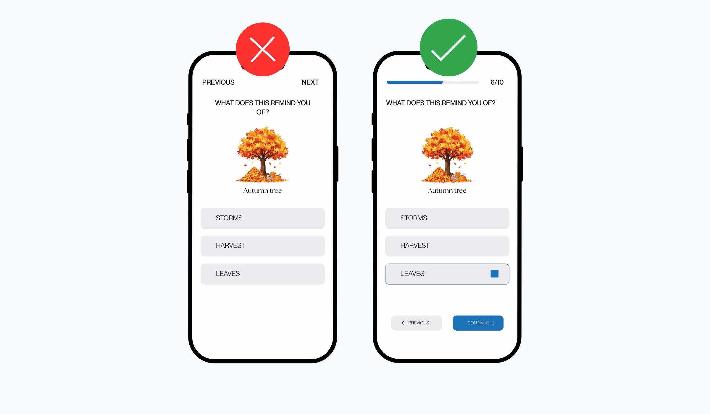
Bad UX isn’t fixed by changing colors, adding animations, or redesigning everything from scratch. Those are surface-level moves. Real fixes reduce friction and make decisions easier for users. Here’s what actually works.
1. Simplify the User Journey Ruthlessly
Every page should have one clear goal. If a page asks users to do five different things, most will do none of them. Clarity beats options every time. So fix:
- Decide the single action you want users to take
- Remove or downgrade everything else
- Make the primary action obvious without scrolling or thinking
If users have to pause and decide what to do next, the journey is already broken.
2. Fix Navigation Before Touching Visual Design
A good-looking website with confusing navigation still fails. Users rely on navigation to orient themselves. If labels are unclear or the structure feels random, they lose confidence fast. Fix:
- Use clear, familiar labels instead of clever names
- Group related pages logically
- Make it obvious where users are and how to go back
If users can’t predict where a click will take them, they won’t click.
3. Improve Forms, Not Just Buttons
Forms are where conversions get nullified. Most forms fail because they ask for too much, too early, or don’t explain what happens next. Fix:
- Remove unnecessary fields
- Use simple, human labels
- Show clear error messages
- Explain why you’re asking for information
The easier the form feels, the higher the completion rate.
4. Design Mobile-First, Not Mobile-Adjusted
Mobile UX is not about shrinking a desktop design. It’s about prioritising what matters. If something is hard to tap, slow to load, or annoying to scroll through on mobile, users won’t push through. Fix:
- Place important content higher
- Use thumb-friendly buttons
- Reduce heavy elements that slow load time
Mobile users are impatient because they have options. And you must respect that.
5. Match UX to User Intent
Not every visitor is ready to convert. Forcing action too early creates friction. Some users want clarity. Some want comparison. Some are ready to act. Fix:
- Informational pages should focus on understanding, not conversion
- Decision pages should reduce doubt
- Conversion pages should remove friction
When UX aligns with intent, actions feel natural instead of forced.
6. Remove Friction Before Adding Features
More features don’t fix bad UX. They usually make it worse. Before adding anything new, ask one question: Does this help users move forward, or does it make them think more? Fix:
- Identify where users hesitate or drop off
- Remove obstacles before adding enhancements
- Prioritise ease over novelty
Simple experiences outperform clever ones almost every time.
Fixing Bad UX Before It Becomes a Growth Problem

In the early stages, user experience issues are easy to ignore. Traffic is low. Leads feel manageable. Small friction doesn’t look urgent. But as visibility increases, the same bad UX problems start affecting more users and compounding losses. What might have felt like a minor issue quietly turns into a serious growth blocker.
- Small UX Issues Scale Faster Than You Expect
Every extra second of load time, every unclear message, and every confusing step creates UX friction. As traffic grows, more users run into the same problems. This is how poor user experience starts impacting conversion rates, engagement, and retention at scale. Fixing bad UX early costs less and creates a stronger foundation for long-term growth.
- Delayed Bad UX Fixes Cost More Later
When bad UX fixes are postponed, problems don’t stay isolated. They lead to rushed redesigns, reactive decisions, and last-minute changes made under pressure. At that stage, businesses aren’t improving website UX thoughtfully. They’re trying to stop losses. Fixing poor UX design early is always cheaper than rebuilding broken journeys later.
- Good UX Supports Growth Without Extra Spend
When user experience design is clear and friction is low:
- Conversion rates improve without increasing traffic
- Marketing campaigns perform better with the same budget
- Sales and support teams spend less time compensating for UX issues
- Strong website user experience removes resistance instead of adding it.
- UX Is a Growth Lever, Not a One-Time Task
Treating UX as a one-time design phase is a common mistake. User experience should evolve as your business grows, your audience changes, and your offerings expand. Regular UX improvements prevent friction from building up and slowing growth later. When bad UX is addressed early, growth feels smoother, more predictable, and easier to sustain.
Stop Losing Conversions to Bad UX With Idea Fueled
If your website gets traffic but not results, you don’t need more ads. You need fewer user experience issues. At Idea Fueled, we audit real behavior, find the friction causing drop-offs, and apply practical bad UX fixes that improve clarity, speed, and conversions without unnecessary redesigns.
Less confusion. More action. Better ROI from the traffic you already have. Let’s fix what’s quietly costing you revenue.
Conclusion
Bad UX costs money. Not hypothetically. Every day.
It shows up as users leaving without converting, ad spend that doesn’t pay back, and teams spending time fixing confusion instead of moving deals forward. Most of this never shows up clearly in reports, which is why it’s easy to ignore.
The fix isn’t a redesign for the sake of it. It’s removing friction, clarifying intent, and making it easier for users to take the next step. When bad UX fixes are handled early, growth becomes simpler. When they’re ignored, growth becomes expensive.
That’s the difference.