


Your idea is not the problem, but your mobile app design is. Most founders walk into investor meetings with a solid idea and a half-baked prototype. It looks fine. It explains the concept. But it does not work.
And that’s exactly why investors pass.
If they can’t tap through your app and instantly understand how it works, you’re asking them to imagine the product for you. And they won’t. This is where most founders lose the deal before the conversation even begins.
This blog walks you through the complete process, from product discovery to a high-fidelity prototype investors can hold and navigate. It also covers the specific mistakes that most founders make before a single screen is designed.
If you are planning to build an app and want funding, read every section.
What is an investor-ready app prototype in Mobile App Design?
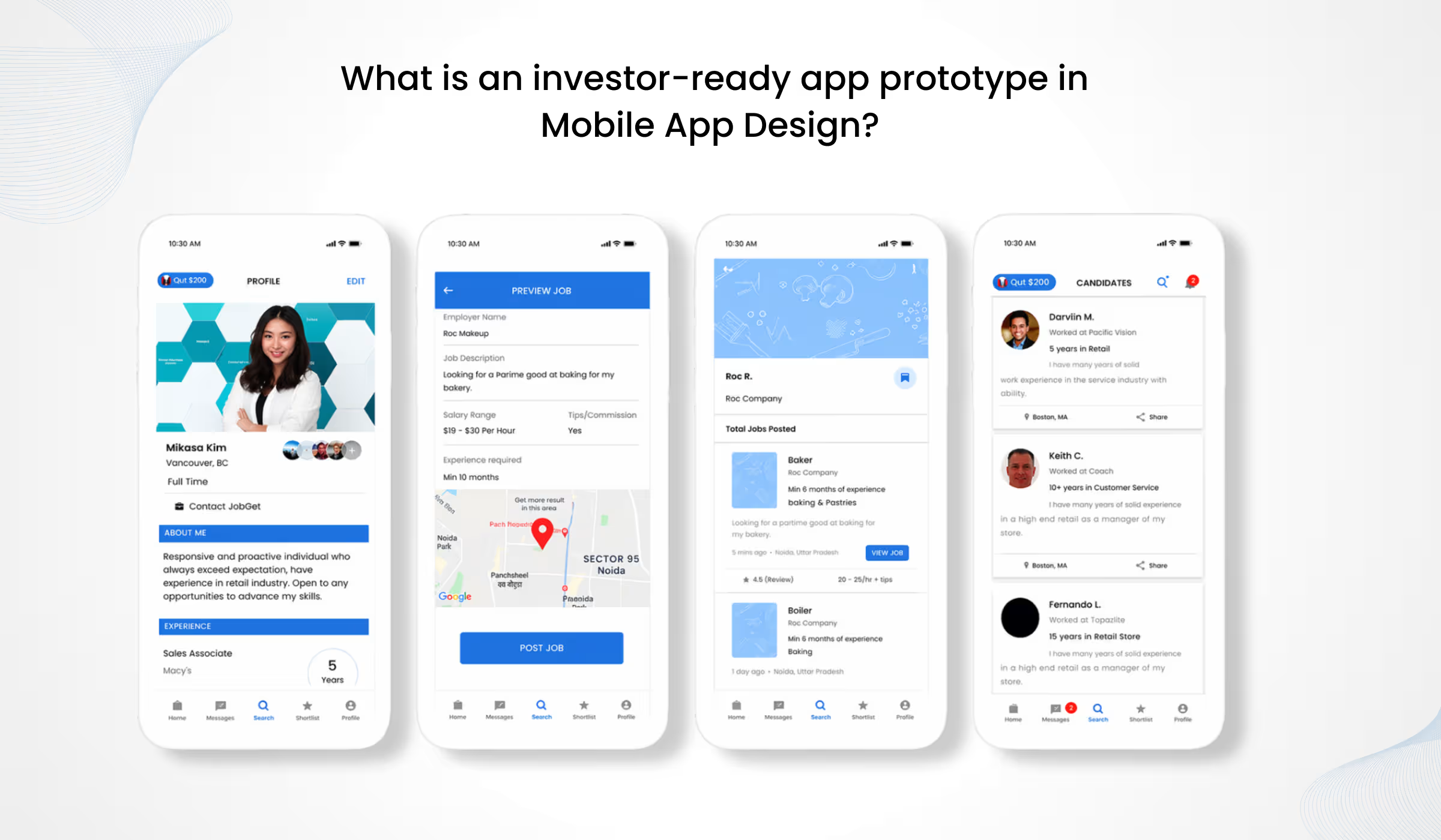
An investor ready app prototype is a high-fidelity, interactive representation of your app. It demonstrates user flow, core functionality, and interface design without requiring a fully built product. It gives investors something tangible to evaluate: how the app works, who it serves, and whether the team can execute.
Most founders assume ‘investor-ready’ means visually polished. It does not.
Investors evaluate three things when they interact with a prototype. First, they check whether the user flow makes sense without explanation. Second, they assess whether the design reflects a deep understanding of the target user. Third, they look at execution quality, whether the team can actually build what they are presenting.
A slide deck describing an app cannot demonstrate any of these things. A device-testable prototype can.
Marc Andreessen of a16z has stated that the best thing a founder can bring to an investor meeting is a working product. If that is not possible yet, a high-fidelity prototype is the next strongest signal of credibility.
The Mistakes Most Founders Make Before Design Even Starts
This is the section the title promises. Here is what actually goes wrong.
Mistake 1: Jumping straight to screen design.
Most founders skip product discovery entirely. They open Figma or hand a brief to a designer and start building screens. The result is a product designed around assumptions. Discovery is where you define the real problem, the real user, and the real market gap. Without it, you are designing the wrong thing, just very carefully.
Mistake 2: Confusing aesthetics with UX.
A beautiful screen that confuses users is not investor ready app prototype material. When an investor taps through your prototype, they are trying to complete a task. If they need your help navigating it, the design has failed.
400% – A well-structured UX design can increase conversion rates by up to 400%. The same principle applies to investor confidence in a prototype. (Source: Forrester Research)
Mistake 3: Designing for both platforms simultaneously.
iOS and Android have different navigation conventions, gesture patterns, and component standards. Designing for both before validating the core product doubles complexity. It also increases the risk of a disjointed user experience on both platforms. Validate one platform first. Then expand.

Step 1: Product Discovery – Design the Right Thing Before Designing It Right
Professional mobile app UI design for startups always starts with discovery, not screens.
Discovery covers four areas.
- Business objective alignment. What does this app need to achieve commercially? Define the goal before anything touches a canvas.
- User persona development. Build one to three specific personas. Concrete people: their role, their device, their pain point, and their current workaround. Vague archetypes like ‘busy professional’ produce vague design decisions.
- Competitive audit. Search the App Store and Play Store in your category. Read the one-star and two-star reviews of competing apps. That is where the real gaps live.
- Market validation. Before any design work begins, find five people in your target market who can confirm the problem is real. If you cannot find five, the discovery process needs more time.
This phase protects every dollar spent on design and development that follows. You can read more about how structured discovery connects to product success in our post on Web, Mobile, and AI App Development for Startups and Enterprises.
Step 2: User Flow Mapping – Build the Architecture Before the Interface
What is a user flow in mobile app design?
A user flow is a visual map of every path a user takes through your app. It shows how they enter, what they do, and where they exit. It is built before any visual design begins and serves as the shared architecture for designers, developers, and stakeholders
Every app prototype needs four flows mapped before design starts.
- Onboarding flow: How a new user gets from download to their first completed action.
- Core feature journey: The primary task your app exists to perform, mapped end to end.
- Error and edge state flows: What happens when something goes wrong or a user takes an unexpected path.
- Retention loop: What brings the user back after the first session.
Decisions made at this stage protect your development budget. Changing a flow after development has started costs significantly more than changing it at the whiteboard stage.
This stage also introduces mobile-specific constraints. Thumb-zone ergonomics, one-handed use, and gesture navigation all influence how flows are structured. A user flow that works logically on paper may not work physically on a phone held in one hand.
Step 3: Wireframing – The Blueprint That Protects Your Budget
What is a wireframe in mobile app design?
A wireframe is a low-fidelity, black-and-white screen layout that defines the structure, hierarchy, and navigation of a mobile app without visual styling. It answers: what goes where, and how does the user move through the app. It is the blueprint before the building begins.
There are two levels of wireframes used in a professional mobile app design process.
- Lo-fidelity wireframes. Rough sketches, sometimes drawn by hand, capturing screen structure and basic flow. Used for early team alignment and fast iteration.
- Mid-fidelity wireframes. Digital, more precise layouts suitable for stakeholder review. They show layout, navigation structure, and input fields without colour or branding.
Wireframes must communicate screen hierarchy, primary and secondary actions, navigation paths, and input areas. They do not include colour, typography, or imagery.
Getting stakeholder sign-off on wireframes before visual design begins is one of the most effective ways to reduce revision costs in any project. Changes at the wireframe stage take minutes. The same changes at the UI design stage take hours. The same changes during development take days and a real budget.
For wireframing, Figma is the industry standard. Balsamiq works well for rapid lo-fi ideation.
Step 4: UI/UX Design – Where Brand, Function, and Trust Converge
This is the stage where wireframes become high-fidelity screens. It is where your app gets its visual identity and where mobile app UI design for startups becomes a full design system.
A design system covers five components: colour tokens, typography scale, component library (buttons, cards, inputs, modals), iconography, and spacing rules. It is not just a style guide. It is the source of truth that keeps every screen consistent and every interaction predictable.
- Platform conventions matter. iOS follows Apple’s Human Interface Guidelines. Android follows Material Design. Designing against these conventions creates friction for users who already have muscle memory for their platform. Design with the conventions, then differentiate through brand.
- Micro-interactions drive perceived quality. The small animations and feedback states that occur when a button is tapped, a form is submitted, or a screen transition signal product maturity. A prototype with well-crafted micro-interactions communicates execution capability.
88% of users are less likely to return after a single bad experience with an app. Good UI/UX design is not optional. It is a retention infrastructure. (Source: Forbes/Forrester Research / UX industry benchmarks)
Accessibility is a standard, not an afterthought. Contrast ratios, tap target sizes (minimum 44×44 points), and readable type sizes are non-negotiable. They affect every user, not just users with disabilities.
For more on how poor UX decisions at this stage affect startup growth, see our post on Signs Your Startup Needs a Website Redesign.
Step 5: Prototype Types – Choosing the Right Fidelity for Your Goal
What are the types of mobile app prototypes?
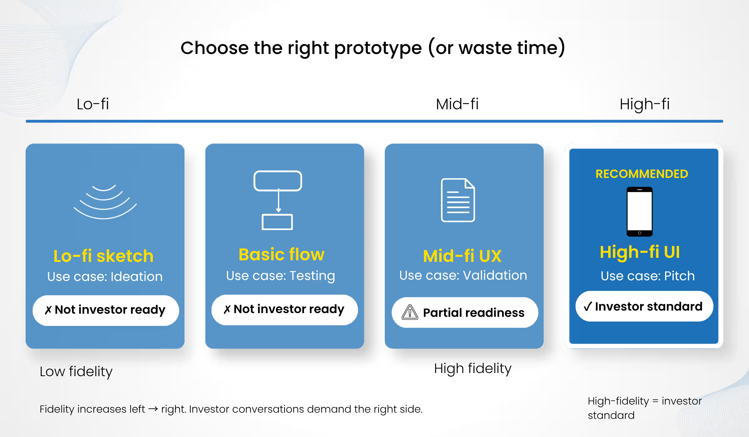
Mobile app prototypes range from low-fidelity sketches used for early ideation to high-fidelity interactive mockups built for investor presentations. The type you choose depends on your goal: team alignment, user testing, or investor pitch. For investor meetings, a high-fidelity, device-testable prototype is the standard.
| Prototype Type | Fidelity | Best For | Investor-Ready? | Primary Tool |
| Lo-fi wireframe | Very Low | Team alignment, early ideation | No | Balsamiq, Paper |
| Clickable wireframe | Low–Medium | User testing, quick iteration | No | Figma |
| Mid-fi prototype | Medium | Stakeholder sign-off, UX validation | Partial | Figma, InVision |
| High-fi prototype | High | Investor pitch, developer handoff | ✓ Yes | Figma, ProtoPie |
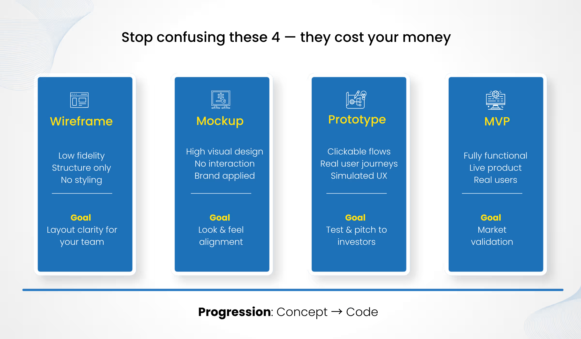
The distinction between wireframe, mockup, prototype, and MVP matters operationally. Confusing these at the wrong project stage wastes design budget and creates misaligned expectations with development teams.
Step 6: Testing and Iteration – Validate Before You Pitch
Testing is the step most founders skip when the investor meeting deadline looms. It is the step that makes or breaks the pitch.
Usability testing at the prototype stage can reduce late-stage development changes by up to 50%. Testing is not a cost. It is cost avoidance. (Source: Nielsen Norman Group / industry usability research)
Five users in your target market will surface the majority of critical usability issues. This is not a large sample. It is an efficient one.
Test one thing: can users complete the core task without your guidance in under 30 seconds? If they cannot, redesign before the investor meeting. Not after.
Iterate based on observed behaviour, not gut instinct. What users do in a prototype tells you more than what they say they want.
What to Bring to the Investor Meeting (And How to Present the Prototype)
What do investors look for in an app prototype?
Investors evaluate five things in a prototype: clarity of the user flow, the core feature demonstrated in under 30 seconds, design polish that signals execution capability, evidence of user understanding in every screen, and transparency from the founder about what is and is not functional.

The three things to have ready for the investor meeting:
- The high-fidelity prototype. Device-testable, not screen-shared from a laptop. Let investors hold it and navigate independently.
- A one-pager. Problem, solution, business model, and any early traction. One page. Nothing more.
- A pitch deck. The supporting document, not the main event. The prototype is the main event.
How to present? Walk investors through the core user journey first. Then let them explore independently. Share the prototype link after the meeting, not before. You control the narrative in the room. Be transparent about what is and is not functional. Investors respect honesty. A prototype that overpromises kills trust faster than a rough build.
The 30-Second Investor Test Framework
Most founders overcomplicate what investors are looking for. In reality, your entire mobile app design is being judged in under a minute. We call this the 30-Second Investor Test Framework. If your investor ready app prototype passes these five checks, you are in the game. If not, you are not even considered.
1. Instant Clarity: Can a first-time user understand what the app does within 5–10 seconds?
2. Frictionless Flow: Can they complete the core action without asking you questions?
3. Obvious Value: Is the primary benefit visible without explanation or storytelling?
4. Execution Signal: Does the design feel like something that can actually be built, not imagined?
5. User Intent Alignment: Does every screen reflect a clear understanding of the user’s real problem?
If your mobile app UI design for startups fails even one of these, investors don’t try harder. They move on.
Why the Design Process Determine Your Development Cost?
Every major design decision made after development has started costs significantly more to implement than the same decision made during the design phase. This is not a guideline. It is the most consistent source of budget overruns in app development projects.
A professional design handoff, including annotated specs, exported assets, a component library, and interaction notes, can reduce development time by weeks. It eliminates the most common source of scope creep: developers interpreting ambiguous designs.
Teams that skip discovery and wireframing almost always rebuild core screens mid-development. That rebuild happens at client cost, after the original design budget is spent.
25% of mobile apps are used only once. Poor user experience at the design phase is a primary driver of single-session abandonment. (Source: Research Gate)
The prototype is the single most important document your development team will use. It defines what gets built, how it behaves, and what the acceptance criteria look like.
Getting this process right requires more than good taste in design tools. It requires a structured methodology, platform expertise, and the ability to translate a founder’s vision into something a development team can actually build without ambiguity.
If you are evaluating whether to hire in-house or work with an agency, our post on Hiring a Web Development Agency for Seed or Series A Companies covers the tradeoffs in detail.
Build a Prototype That Earns Trust, Not Just Attention
The mobile app design process described in this blog is not optional for founders who want funding. It is the difference between a product that earns investor confidence and one that earns a polite ‘we’ll be in touch.’
Discovery, user flow mapping, wireframing, UI design, prototyping, and testing form a sequence. Skip any step and the steps that follow cost more time and more money to fix.
The investor ready app prototype at the end of this process is not just a design deliverable. It is proof of execution. It shows investors that the team thinks clearly, understands users deeply, and can bring a product to life.
If you are building a mobile app and want a mobile app design company that takes you from product discovery through a prototype your investors can interact with, Idea Fueled specialises in exactly that.
Work With a Mobile App Design Company That Actually Delivers
Your mobile app design should make sense instantly, without explanation, without guidance.
At Idea Fueled, we build investor ready app prototypes that show clear user flow, strong UX thinking, and real execution from the first interaction.
See what we’ve built:
- Toggl Turned Confused Visitors into Confident Users with Better Landing Pages
- How Medfin Transformed Patient Experience with a Fast, Mobile-First Website
- How Pizza Hut Japan Modernized Operations with a Fully Integrated Digital Ecosystem
If you’re serious about funding, the next step is simple.
Click the link, fill out the form, and we’ll help you build a prototype that actually holds up in front of investors.
Conclusion
Most apps fail before they are built, not because of bad ideas, but because of weak mobile app design. Discovery, user flows, wireframing, UI design, prototyping, and testing are not optional steps.
They are the difference between confusion and clarity. A strong investor ready app prototype does more than demonstrate your idea. It proves that you can execute it.
And that is what investors fund.
Frequently Asked Questions
1. What is the difference between a wireframe and a prototype?
A wireframe is a static, low-fidelity layout showing screen structure and navigation without styling. A prototype is an interactive, clickable simulation of the app experience. For investor pitches, a high-fidelity prototype that closely resembles the final product is the standard. A mockup sits between them: it shows visual style but does not have interaction.
2. How long does it take to go from idea to investor-ready prototype?
A structured process covering product discovery, user flow mapping, wireframing, UI design, and prototyping typically takes 4 to 8 weeks, depending on app complexity and the number of core screens. Skipping discovery to save time almost always adds weeks of rework downstream.
3. Do I need a prototype to pitch investors?
Yes. For any app at the pre-seed or seed stage, a high-fidelity interactive prototype is the minimum credible standard. A pitch deck alone signals that the product has not been validated. A working prototype signals that the team can execute.
4. How much does mobile app design cost?
Professional mobile app design including discovery, wireframing, and a high-fidelity prototype typically ranges from $5,000 to $25,000 or more, depending on app complexity, screen count, and whether a design system is included. Projects that skip discovery tend to cost more in development rework than the discovery phase would have cost.
5. What tools are used to create mobile app prototypes?
Figma is the industry standard for both UI design and interactive prototyping. InVision and ProtoPie are used for advanced interaction and animation design. Balsamiq is commonly used for lo-fi wireframing. For investor presentations, Figma-based high-fidelity prototypes with device-testable clickable flows are the most widely used format.
5. When should I hire a mobile app designer vs. build in-house?
If your founding team does not include a product designer with mobile app experience, hire mobile app designer services from an app design and development company early. The cost of correcting poor design decisions during development is almost always higher than the cost of getting the design right from the start. You can also read our guide on when to hire a development agency vs build in-house for a full comparison.