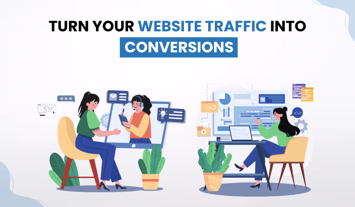
Your SaaS website is probably getting traffic. It is probably not generating enough pipeline. And the gap between those two facts is not random. Somewhere between the first visit and the demo request, qualified buyers are making a simple decision to leave. You never see it happen. You only see the flat conversion numbers afterward.
The frustrating part is that most SaaS teams respond by driving more traffic at the same broken structure. More ads. More content. Same results. This guide is about fixing that structure. Here is what a website built for pipeline actually looks like, and what yours might be getting wrong right now.
Traffic Websites vs. Pipeline Websites
Here is the direct answer to a question most SaaS teams never ask explicitly:
A traffic website is optimized for arrival. A pipeline website is optimized for progression.
Traffic websites focus on content volume, keyword rankings, and pageview metrics. They tell a brand story and attract visitors. Pipeline websites focus on buyer behavior. Every page has a job. Navigation reflects decision stages. CTAs match intent. Social proof appears where doubt is highest.
| Traffic Website | Pipeline Website |
| Optimized for sessions and rankings | Optimized for demos, trials, and MQLs |
| Navigation organized by product area | Navigation organized by buyer stage |
| CTAs are generic (“Learn More”) | CTAs match intent and funnel stage |
| Social proof lives on a single page | Social proof placed at points of doubt |
| Success is equal to pageviews and time on site | Success is equal to pipeline volume and lead quality |
Why Your Buyers Have Already Decided Before They Call?
According to Gartner, B2B buyers spend only 17% of their total purchase journey meeting with potential vendors. The remaining 83% is independent research. By the time a buyer contacts your sales team, they have already formed their first, second, and often final impression through your website.
Your website needs to do the selling that sales teams once did in early discovery calls. It must demonstrate credibility, handle objections, and qualify interest before a human is ever involved.
This has three direct implications:
- Self-serve research first. Buyers want pricing, comparisons, and case studies without booking a demo just to get the basics.
- Social proof throughout, not in one place. Trust signals must appear at the moments buyers hesitate most.
- Active intent qualification. The goal is not to push every visitor toward a demo. It is to help the right visitors self-select into the right next step.
Real case: A B2B SaaS design agency replaced a 14-word jargon-heavy hero headline with a six-word outcome statement. Demo clicks rose 27% within nine days. Same product. Same traffic. Only the clarity changed.
Source: Stan Vision, SaaS Website Design Framework, 2026
The 5 Structural Elements of a High-Converting SaaS Website
A high-converting SaaS website is built on five elements: conversion-led messaging, intent-based navigation, strategic social proof placement, funnel-matched CTAs, and qualification-first forms. Each addresses a specific breakdown point in the buyer journey.
1. Conversion-Led Messaging Architecture
Feature-first copy is the most common failure on SaaS homepages. Buyers do not purchase products. They purchase outcomes.
When writing SaaS website homepage copy, the structure must follow: outcome first, differentiator second, proof third. Every headline, subheader, and microcopy line should be traceable to a specific buyer problem.
“The best positioning makes it obvious who the product is for and why it is better than the alternative. If customers have to work to figure that out, you have already lost them.”
~ April Dunford, Author, Obviously Awesome; B2B Positioning Strategist
2. Intent-Based Navigation
Most SaaS navigation menus organize around the product, not the buyer. Dropdowns labeled Platform, Solutions, and Resources reflect company thinking, not buyer thinking.
Intent-based navigation organizes the experience around decision stages. A first-time visitor needs a fast overview. A buyer in consideration needs comparisons, pricing, and case studies.
A buyer close to deciding needs demo booking and ROI proof. When navigation matches these stages, friction drops and progression increases.
3. Strategic Social Proof Placement
Social proof does not work when it lives on a dedicated Customers page that few visitors reach. It works when it appears at the exact moment a buyer experiences doubt.
Logo bars belong above the fold, before the buyer has time to disengage. Testimonials belong adjacent to CTAs, not in a separate section. Case study callouts belong on feature pages.
G2 or Capterra review snippets belong on the pricing page, where purchase anxiety peaks. Specificity builds credibility. A named result beats a generic endorsement every time.
Real case: A MarketingSherpa study on a B2B SaaS product page found that placing customer logos and testimonials directly below the CTA, combined with a cleaner hero design, lifted conversion from 6.89% to 10.95%, a 59% increase, at 98% statistical confidence.
(Source: MarketingSherpa, Conversion Optimization for B2B SaaS Companies)
4. SaaS Website CTA Optimization
SaaS website CTA optimization is not about wording alone. It is about matching the CTA to where the buyer actually is.
- “Learn More” is a traffic CTA.
- “Book a Demo” is a pipeline CTA.
- “See It In Action” serves buyers who want proof before committing to a call.
Placing “Book a Demo” above the fold, before a visitor understands the product, is aggressive and counterproductive. Placing “Learn More” on a pricing page, when a buyer is already evaluating purchase, is a missed conversion.
The rule is simple: match the CTA to the buyer stage, not the stage you want them to be at.
5. Qualification-First Forms and Flows
Long lead capture forms suppress conversion. Short forms that collect unqualified leads waste sales time. The answer is progressive qualification.
A first-touch form collects name and work email only. Qualification happens next, through routing logic that asks role, team size, and use case before the calendar appears.
Tools like Chilipiper, Qualified, and HubSpot native routing handle this effectively. The goal is to reduce perceived friction at first contact while giving the sales team what it needs before the first call.
“Your homepage is not where you close deals. It is where you earn the right to have a conversation. Every element should reduce doubt, not just explain features.”
~Peep Laja, Founder, CXL Institute; CRO practitioner and B2B conversion researcher
How Idea Fueled Helped Toggl Convert Confused Visitors into Confident Users! Toggl had three well-built products and a website that kept them invisible. No dedicated landing pages. No onboarding flow. No clear path from interest to sign-up. Visitors arrived, found no reason to stay, and left. This is one of the most common SaaS website conversion optimization failures we see. The product is ready. The buyers are arriving. The website is simply not doing its job. Idea Fueled rebuilt the experience from the ground up. Product-specific landing pages were designed in Figma and developed in Webflow, each built around one goal: make the product immediately understandable and make the next step impossible to miss. A simplified onboarding flow guided visitors from first impression to demo request without friction. Result: Visitor engagement roughly doubled. Sign-ups and demo requests increased by approximately 2.5 times. Same traffic. Rebuilt structure. Completely different pipeline outcome. “Esha from Idea Fueled helped us with landing page designs in Figma and then developing them in Webflow. I am happy with the final product.” Ryan Prior, VP Marketing, Teamweek OÜ (Toggl) Source: IdeaFueled, Toggl Case Study |
The Technical Foundation That Supports Conversion
Conversion architecture does not live in copy and design alone. Technical performance is a direct conversion variable.
According to First Page Sage, B2B SaaS companies that invest in SEO and site speed achieve a 702% ROI from organic search, with a break-even period of just seven months. Slow pages do not just hurt rankings. They drain every ad dollar spent driving traffic to them.
Three technical priorities matter most:
- Core Web Vitals. Largest Contentful Paint under 2.5 seconds, Cumulative Layout Shift under 0.1, and Interaction to Next Paint under 200ms. These thresholds correlate directly with both search rankings and conversion rates.
- Structured data markup. FAQ schema on high-intent pages increases featured snippet and AI Overview capture. Organization schema establishes brand credibility in search. Review schema surfaces star ratings in SERPs before a buyer even arrives on the site.
- Internal linking for buyer progression. Internal links serve as a UX tool, not just an SEO tactic. A pricing page should link to relevant case studies. A feature page should link to comparisons or ROI calculators. The linking structure should mirror the buyer journey.
SaaS Website Audit Checklist: 5 Checks to Run Today

A SaaS website audit checklist does not require a specialist. The following five checks surface the most common and highest-impact conversion failures on any B2B SaaS website.
1. Does your hero copy name an outcome?
Read your homepage headline aloud. Does it describe what your customer achieves, or what your product is? If a visitor cannot tell who this is for within five seconds, messaging is the first fix.
2. Do your CTAs match buyer intent at each stage?
Map every primary CTA against the page it appears on. A blog post CTA should not be Book a Demo. A pricing page CTA should be your highest-commitment offer. Mismatched CTAs are among the most common SaaS website CTA optimization failures.
3. Is social proof visible before the fold on key pages?
Check your homepage, pricing page, and top landing pages. If a logo, result, or named customer quote is not visible without scrolling, it is not doing its job.
4. Are your forms qualifying or just collecting?
Submit a test lead through your primary conversion form. Does the routing logic reflect buyer role and intent? If the form collects email addresses without qualifying context, it generates data, not pipeline.
5. Does your site load in under three seconds on mobile?
Run your homepage through Google PageSpeed Insights. Check the mobile score specifically. A score below 50 on mobile is a measurable conversion drag. Address image compression, render-blocking scripts, and server response time first.
Running this audit across your five highest-traffic pages surfaces more actionable intelligence than most full-scale redesigns produce.
Conclusion: Pipeline Is an Architecture Problem, Not a Traffic Problem
The SaaS companies generating consistent inbound pipelines are not always driving more traffic. They build websites that treat every visit as a structured evaluation opportunity, where SaaS website conversion optimization is a discipline applied at every layer: messaging, navigation, proof, CTAs, forms, and technical performance.
If your site is generating traffic but not pipeline, the structure is the problem. Structural problems are fixable, often without a full redesign.
Is your SaaS website generating traffic but losing pipeline before the demo request?
Idea Fueled offers website conversion audits for SaaS and B2B companies. We identify exactly where qualified buyers drop off and what to fix first. Book a website audit today.
Frequently Asked Questions (FAQs)
1. My SaaS website gets decent traffic but almost no demo requests. Where is the problem?
The problem is almost never traffic volume. It is what happens after the click. Most SaaS websites are built to attract visitors, not to move them toward a decision. The most common breakdown points are: a homepage headline that describes the product instead of the outcome, CTAs that do not match where the buyer is in their evaluation, social proof buried on a page most visitors never reach, and lead forms that create friction before the buyer has any reason to trust you. If sessions are climbing but demo requests are flat, treat it as a structural problem, not a traffic problem. Fix the messaging, navigation, and CTA alignment before spending another dollar on ads.
2. What is the difference between a SaaS website built for traffic and one built for pipeline generation?
A traffic website is optimized for arrival. A pipeline website is optimized for progression. Traffic websites focus on keyword rankings, content volume, and pageviews. Pipeline websites are built around buyer behavior: every page has a job, navigation reflects decision stages, CTAs match intent, and social proof appears where doubt is highest. The distinction matters because a site can rank well, attract thousands of visitors, and still generate no qualified pipeline if it was never designed to move buyers forward. SaaS website pipeline generation requires a fundamentally different architecture than SEO-led content strategy.
3. How do I write homepage copy for a SaaS website that actually converts?
When writing SaaS website homepage copy, follow this structure: outcome first, differentiator second, proof third. The hero headline must answer one question in under five seconds: what does the buyer achieve by using this product? Feature-first copy is the most common homepage failure in B2B SaaS. Buyers do not purchase software. They purchase the result the software delivers. Every headline, subheader, and CTA should be traceable to a specific buyer problem, not a product capability. If a visitor has to read three paragraphs to understand who the product is for and why it matters, the copy needs to be rewritten.
4. Why does placing “Book a Demo” above the fold hurt conversions on a SaaS website?
Placing “Book a Demo” above the fold asks a buyer to commit time to a sales call before they understand what the product does or whether it is relevant to them. According to research, “Book a Demo” as a standalone CTA converts at approximately 1.5% because most visitors recognize it as a signal for a sales conversation, which creates psychological friction. SaaS website CTA optimization means matching the call to action to the buyer’s actual stage. Above the fold, where a visitor is still orienting, a lower-commitment CTA such as “See How It Works” or “See It In Action” reduces resistance and increases the likelihood of progression. “Book a Demo” performs best further down the page, after messaging has established relevance and proof has handled initial objections.
5. How many form fields should a SaaS lead capture form have to maximize conversions?
A first-touch SaaS lead capture form should collect only two fields: name and work email. Every additional field at the point of first contact measurably reduces conversion. Qualification should happen after the initial submission, through routing logic that asks role, company size, and use case before a calendar appears. This approach is called progressive qualification. It reduces perceived friction at the moment of highest doubt while still giving the sales team the context they need before the first call. Tools like Chilipiper, Qualified, and HubSpot native routing handle this flow effectively. The goal is not to collect less information. It is to collect it at the right stage.
6. Can a SaaS website improve conversions without a full redesign?
Yes, and in most cases a full redesign is not the first fix. The highest-impact conversion improvements on a SaaS website come from five targeted changes: rewriting the hero headline to lead with an outcome, realigning CTAs to match buyer stage on each page, moving social proof above the fold on the homepage and pricing page, shortening the first-touch lead capture form to two fields, and ensuring the site loads in under three seconds on mobile. Running a focused SaaS website audit across the five highest-traffic pages will surface more actionable intelligence than most redesigns produce. Structural problems are fixable without rebuilding from scratch.


